Case Study / App Design / Grab / Rainy Day Tipping
Responsibilities
Product strategy
Interaction design
User research
Design QA
Platform
iOS and Android (Consumer app)
Product
Grab
Year
2025

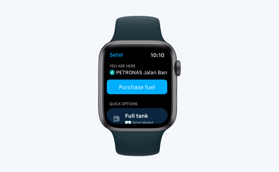
↑ Sneak peak of the new tipping experience
In Southeast Asia, heavy rain significantly impacts Grab’s delivery supply. While various incentives exist to keep the system moving, some drivers naturally weigh their total potential earnings against the increased hardship of riding in wet weather. I proactively initiated this project after identifying an opportunity to reinforce driver supply by tapping into the natural empathy users feel for the driver delivering their meal in difficult conditions. The goal was to encourage users to show their appreciation through a tip, turning a momentary feeling into a consistent habit.
The demand-supply gap → When it rains, Grab faces a dual challenge: customer demand for deliveries spikes, but the number of active drivers drops. This imbalance leads to lower fulfilment rates, meaning some users can't get their food, and the platform loses potential revenue. Since drivers are independent partners, they choose when to be on the road; if the effort of riding in the rain doesn't feel worth the reward, they simply go offline.

↑ This 8% drop represents unfulfilled orders during rain
As the product designer of the team, I self-initiated the strategy and built the business case to transform situational empathy into tangible support for our drivers via tipping. I focused on creating a modern, high-fidelity experience using tailored animations and a refreshed interface to make tipping feel like a genuine gesture of thanks rather than just another payment step. This empathy-driven framework proved so effective that it was later scaled across the region and adapted for other service verticals and occasions.
How might we reinforce driver supply during rain by turning situational empathy into a consistent tipping habit?
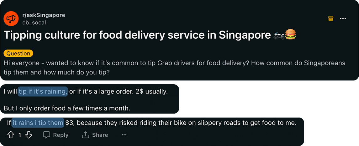
Our data showed that even without any prompting, tipping frequency naturally rose by 2.5% during rain. This proved that users were already feeling empathetic. The opportunity was to design an experience that amplified this existing human emotion, making it so easy and rewarding to tip that it became a standard part of the rainy-day delivery flow.
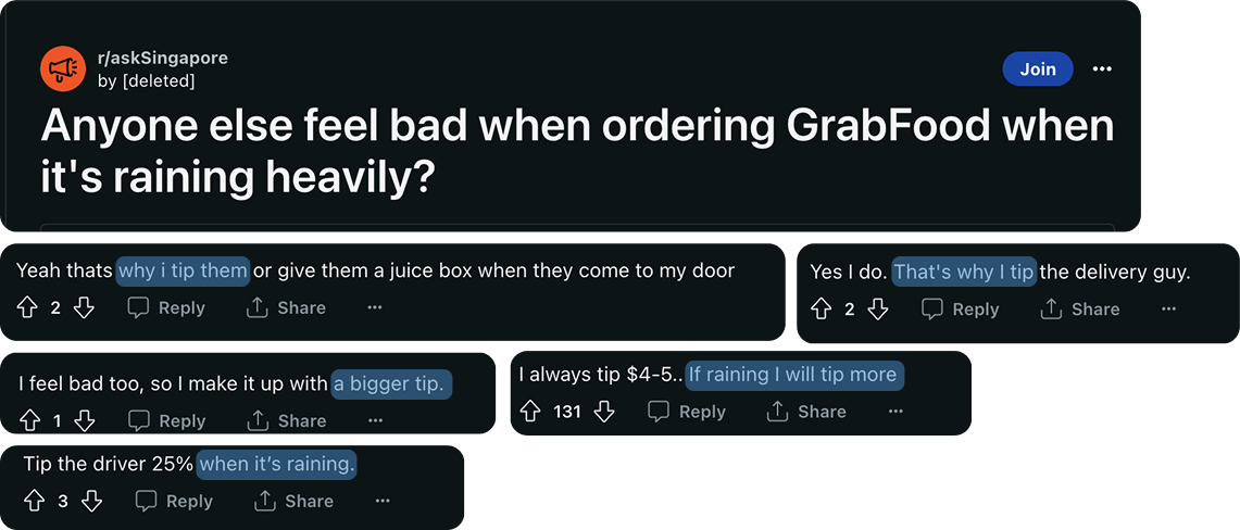
↑ Source: Reddit
While tipping is not traditionally a core part of Southeast Asian culture, community discussions highlighted a desire to reward drivers for their commitment. A 'gratitude gap' we could bridge through design.
↑ Source: Reddit
By shifting the tipping experience from a, transactional payment to a modern, gratitude-focused, interaction we can increase the frequency and amount of tips.
This additional income acts as a meaningful incentive for drivers to stay active, ultimately improving fulfilment rates during adverse weather.
Users can tip their driver at multiple stages of the journey; both during the trip and after the delivery is completed. The flow below illustrates the typical GrabFood experience and identifies the specific moments where tipping is surfaced to the user.

↑ GrabFood flow
1
Static & outdated UI → The existing interface had not been refreshed in a significant amount of time, resulting in a visual style that felt disconnected from the modern Grab ecosystem. This functional but forgotten look made the feature feel less trustworthy and important to the user.
2
Purely transactional tone → Tipping is a human-to-human interaction, yet the UI treated it like a cold bank transfer. By focusing only on the financial transaction, we were missing a critical opportunity to celebrate the emotional connection between the user and the driver.
3
Visual disconnect from the driver → The previous information architecture placed the tipping widget in a silo, visually separating the action of giving from the person receiving it. This lack of focus on the driver failed to trigger the "feel-good" factor that naturally encourages empathy.
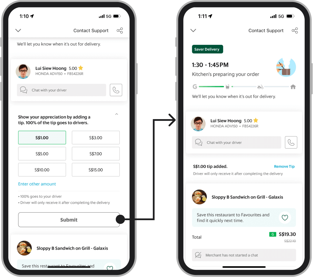
↑ The previous UI: functional but transactional and visually disconnected from the driver.
While tipping exists at multiple stages, we chose to focus the revamp exclusively on the In-trip window to validate our empathy-driven hypothesis. We explored several alternatives, including a cart page upsell, but ultimately moved away from them to protect the core 'Place Order' conversion.
1
Cart page exploration (Discarded) → We decided against adding tipping to the checkout flow to avoid introducing friction. Our priority was to maintain a seamless 'Place Order' conversion rate without distracting users with additional payment decisions before the purchase.
2
Revamping the In-Trip experience → We focused on the 'In-Trip' window because it represents the peak of user empathy. Once the order is placed and the user sees their driver heading out into the rain, the driver's effort becomes tangible. We chose to capitalise on this emotional moment to drive a more genuine tipping gesture.
I explored several ways to bring empathy into the journey, balancing
visibility with the user's focus at different stages. While the cart-based 'round-up' options were
low-friction, they felt too transactional and detached from the driver's effort.
The 'In-trip full-screen exploration (shown on the right) allowed
for powerful storytelling and emotive illustrations, but it risked being too intrusive. Ultimately, these
explorations led us to the In-trip inline version; an approach that combined the emotional impact of the
full-screen concept with a non-intrusive layout that made it effortless to tip without leaving the
tracking screen
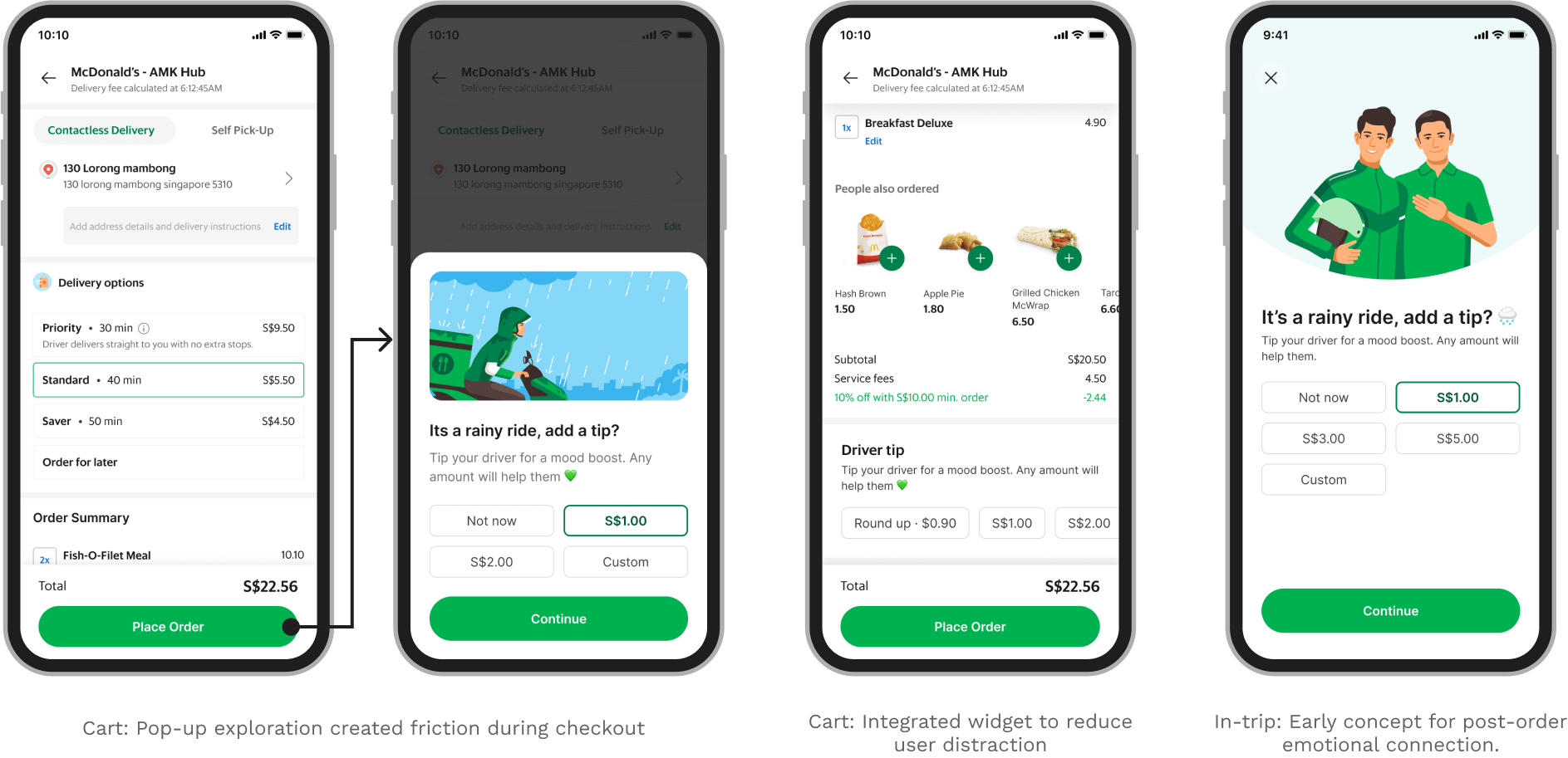
↑ Initial explorations
After multiple rounds of design reviews, user testing, and alignments with stakeholders, we arrived at a final solution that balances ease of use with emotional impact. By refining the interface and introducing modern interactions, we transformed the tipping experience into a high-fidelity moment of gratitude that feels like a natural part of the journey.
↑ Final design: a seamless, one-tap tipping experience
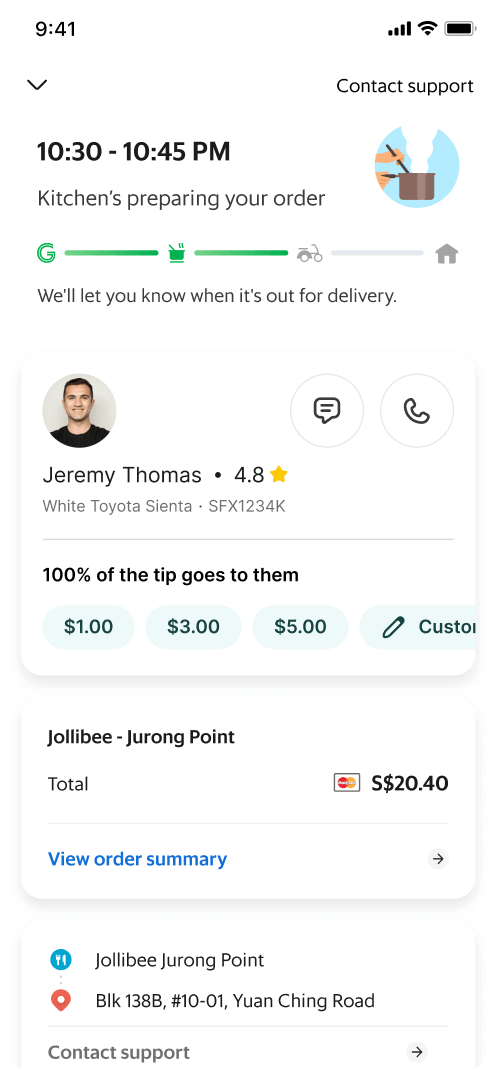
State 1: No rain widget yet
State 2: The rain widget appears
after a delay to grab user's attention
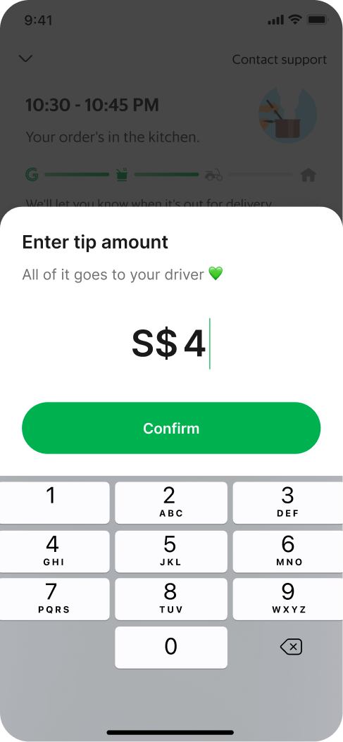
State 3: Option to select a preset
or enter a custom tip amount
State 4: Post-tip gratitude state
↑ Final design breakdown
Building an empathy-driven solution was the primary goal of this project. Drivers do an amazing job delivering despite challenging weather and deserve every possible reward they can earn. This design revamp was intended to nudge and encourage users toward giving more tips. Here is how we achieved that:
1
Modern UI and information architecture → The driver details and tipping widget received a complete overhaul. By unifying the driver information and tipping options into a single, cohesive widget, we increased the visual connection and empathy toward the driver.
2
Rain animation → Most users are aware when it is raining outside, which may well be the reason they chose to place an order rather than going out to eat. The situational rain animation catches the user's attention and reinforces the reality of the driver's environment, directly driving empathy.
3
Personalised connection → The new information architecture makes tipping feel more personal. By closely linking the tip to the driver's profile, we moved the interaction away from a generic payment and toward a meaningful personal gesture.
4
Gratitude-led feedback → Human interactions are driven by positive reinforcement. Unlike the previous transactional design, this version rewards the user with a "big thank you" message and animation, making them feel valued for their generosity.
5
Simplified decision making → To reduce cognitive load and analysis paralysis, we reduced the tipping suggestions from six options down to three. We focused on the act of giving itself rather than the amount, ensuring that any tip feels like a significant and appreciated gesture.
No of orders with tips
+3.4%
Regional
Tipping amount
+62.2%
in Singapore (Regional: +44%)
This project was a self-initiated challenge that has become one of my favourite experiences at Grab. It demonstrated how design can bridge the gap between business objectives and human empathy.
1
Business validation challenge → Was challenging to get the product stakeholder buy in because it was not pushing the business numbers directly. As first it will create a habit in users and only it will affect the fulfilment.
2
Designing for a non-tipping culture → Since tipping is not traditionally a core part of Southeast Asian culture, we had to shift the focus from the transaction to the driver. By emphasising the driver's effort during difficult weather, we tapped into a genuine desire to help, making the habit feel natural rather than forced.
3
Across vertical adoption → The success of the new tipping widget led to its adoption across multiple verticals. The design will be used for various empathy-driven use cases beyond rain, serving as the new standard for gratitude interactions across the platform.
4
Next milestone: monitoring fulfilment → While the current impact is measured by tipping volume, the ultimate goal remains solving the fulfilment dip during rainy weather. Our next step is to monitor fulfilment data as the tipping habit matures, validating the long-term effectiveness of this empathy-led intervention.
5
New component → This project introduced the "immersive banner" above the driver card, a first-of-its-kind component for our design system. It has since provided a framework for other teams to surface information without cluttering the main UI.
This project demonstrated how design-led initiatives can influence complex operational metrics, like driver supply, by focusing on human emotion rather than just functional transactions. By initiating this revamp and securing stakeholder buy-in, I learned to frame design goals in the language of business strategy, proving that building a long-term tipping habit is a one way to look into towards stabilising fulfilment. Ultimately, creating a platform-agnostic, empathy-driven component allowed us to scale this gratitude framework across the entire ecosystem, providing a new standard for how Grab acknowledges the hard work of its partners.